水平居中
1. 使用 text-align
1
2
| .parent { text-align: center; }
.child { display: inline-block; }
|
2. 定宽块级元素
方法一:
1
| .child { margin: 0 auto; }
|
方法二:
1
2
3
4
5
| .child {
position: relative;
left: 50%;
margin-left: -150px;
}
|
方法三:
1
2
3
4
5
6
7
8
9
10
| .parent {
height: 300px;
position: relative;
}
.child {
position: absolute;
left: 0;
right: 0;
margin: 0 auto;
}
|
方法四:
1
2
3
4
5
6
| .parent { position: relative; }
.child {
position: absolute;
left: 50%;
transform: translateX(-50%);
}
|
3. flex 布局
1
2
3
4
5
| .parent {
height: 300px;
display: flex;
justify-content: center;
}
|
4. grid 布局
1
2
3
4
5
6
7
8
9
10
11
12
| .parent {
height: 300px;
display: grid;
justify-items: center;
justify-content: center;
}
.child {
margin: auto;
}
|
垂直居中
1. 行内块级元素
1
2
3
4
5
6
7
| .parent {
line-height: 500px;
}
.child {
display: inline-block;
vertical-align: middle;
}
|
2. 定位方式
方法一:
1
2
3
4
5
6
7
8
| .parent {
position: relative;
}
.child {
position: absolute;
top: 50%;
margin-top: -150px;
}
|
方法二:
1
2
3
4
5
6
7
8
9
10
| .parent {
position: relative;
}
.child {
height: 300px;
position: absolute;
top: 0;
bottom: 0;
margin: auto;
}
|
方法三:
1
2
3
4
5
6
7
8
| .parent {
position: relative;
}
.child {
position: absolute;
top: 50%;
transform: translateY(-50%);
}
|
3. flex 布局
1
2
3
4
5
6
7
8
9
| .parent {
display: flex;
align-items: center;
}
.child {
margin: auto;
}
|
4. grid 布局
1
2
3
4
5
6
7
8
9
10
11
12
13
| .parent {
display: grid;
align-items: center;
align-content: center;
}
.child {
margin: auto;
align-self: center;
}
|
水平垂直居中
1. 行内块级元素
1
2
3
4
5
6
7
8
| .parent {
line-height: 500px;
text-align: center;
}
.child {
diaplay: inline-block;
vertical-align: middle;
}
|
2. 定位方式
方法一:
1
2
3
4
5
6
7
8
| .parent {
position: relative;
}
.child {
position: absolute;
left: calc(50% - 150px);
top: calc(50% - 150px);
}
|
方法二:
1
2
3
4
5
6
7
8
9
10
| .parent {
position: relative;
}
.child {
position: absolute;
left: 50%;
top: 50%;
margin-left: -150px;
margin-top: -150px;
}
|
方法三:
1
2
3
4
5
6
7
8
9
10
11
| .parent {
position: relative;
}
.child {
position: absolute;
left: 0;
top: 0;
right: 0;
bottom: 0;
margin: auto;
}
|
方法四:
1
2
3
4
5
6
7
8
9
| .parent {
position: relative;
}
.child {
position: absolute;
left: 50%;
top: 50%;
transform: translate(-50%, -50%);
}
|
3. flex 布局
1
2
3
4
5
6
7
8
9
| .parent {
display: flex;
align-items: center;
justify-content: center;
}
.child {
margin: auto;
}
|
4. grid 布局
1
2
3
4
5
6
7
8
9
10
11
12
13
14
15
16
17
18
19
20
21
22
23
24
| .parent {
display: grid;
align-items: center;
justify-items: center;
place-items: center;
align-content: center;
justify-content: center;
place-content: center;
}
.child {
margin: auto;
align-self: center;
justify-self: center;
place-self: center;
}
|
两列布局
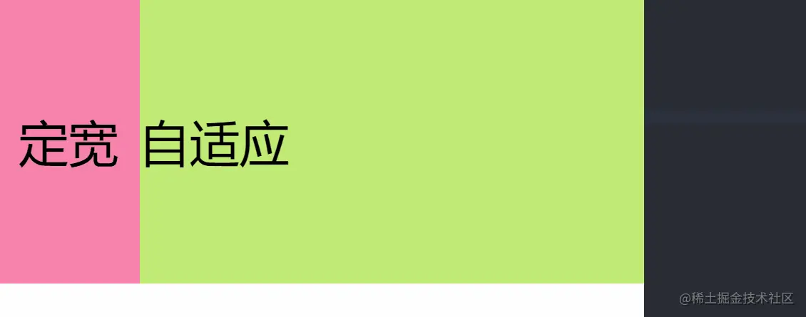
所谓的两列布局就是一列定宽(也有可能由子元素决定宽度),一列自适应的布局。
1. float + calc()
1
2
3
4
5
6
7
| .left {
float: left;
}
.right {
float: left;
width: calc(100% - 200px);
}
|
2. float + margin-left
1
2
3
4
5
6
| .left {
float: left;
}
.right {
margin-left: 200px;
}
|
3. absolute + margin-left
1
2
3
4
5
6
| .left {
position: absolute;
}
.right {
margin-left: 200px;
}
|
4. float + overflow
1
2
3
4
5
6
7
| .left {
float: left;
}
.right {
overflow: hidden;
}
|
5. flex 布局
1
2
3
4
| .container {
display: flex;
}
.right { flex: 1; }
|
6. grid 布局
1
2
3
4
| .container {
display: grid;
grid-template-columns: auto 1fr;
}
|
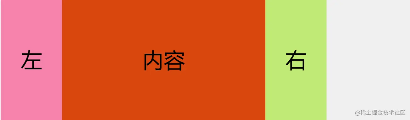
三列布局
三列布局主要分为两种:
- 第一种是前两列定宽,最后一列自适应,这一种本质上与两列布局没有什么区别,可以参照两列布局实现。
- 第二种是前后两列定宽,中间自适应。
1. position
1
2
3
4
5
6
7
8
9
10
11
12
13
14
15
| .left {
position: absolute;
left: 0;
top: 0;
}
.center {
width: calc(100% - 400px);
margin-left: 200px;
margin-right: 200px;
}
.right {
position: absolute;
right: 0;
top: 0;
}
|
2. flex 布局
1
2
| .container { display: flex; }
.center { flex: 1; }
|
3. grid 布局
1
2
3
4
| .container {
display: grid;
grid-template-columns: auto 1fr auto;
}
|
等分布局
等分布局就是将一个容器平均分成几等份,这里以 4 等分为例。
1. 浮动 + 百分比
1
2
3
4
| .item {
float: left;
width: 25%;
}
|
2. 行内块级 + 百分比
1
2
3
4
5
6
7
| .container {
font-size: 0;
}
.item {
display: inline-block;
width: 25%;
}
|
3. flex 布局
1
2
| .container { display: flex; }
.item { flex: 1; }
|
4. grid 布局
1
2
3
4
| .container {
display: grid;
grid-template-columns: repeat(4, 1fr);
}
|
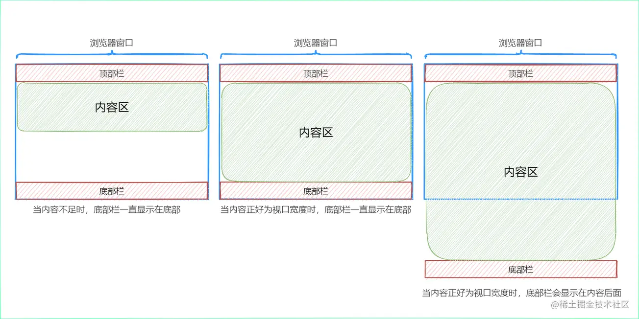
Sticky Footer布局是页面内容不够长时,底部栏就会固定到浏览器的底部;如果足够长时,底部栏就后跟随在内容的后面。
1. 绝对定位
1
2
3
4
5
6
7
8
9
10
11
12
13
14
15
16
| html,
body {
margin: 0;
padding: 0;
height: 100%;
}
.main {
position: relative;
min-height: 100%;
}
.bottom {
position: absolute;
width: 100%;
height: 100px;
bottom: 0;
}
|
2. calc 函数
1
2
3
| .container {
min-height: calc(100vh - 200px);
}
|
3. flex 布局
1
2
3
4
5
6
7
8
| .main {
display: flex;
flex-flow: column;
min-height: 100vh;
}
.container {
flex: 1;
}
|
4. grid
1
2
3
4
5
| .main {
display: grid;
grid-template-rows: auto 1fr auto;
min-height: 100vh;
}
|
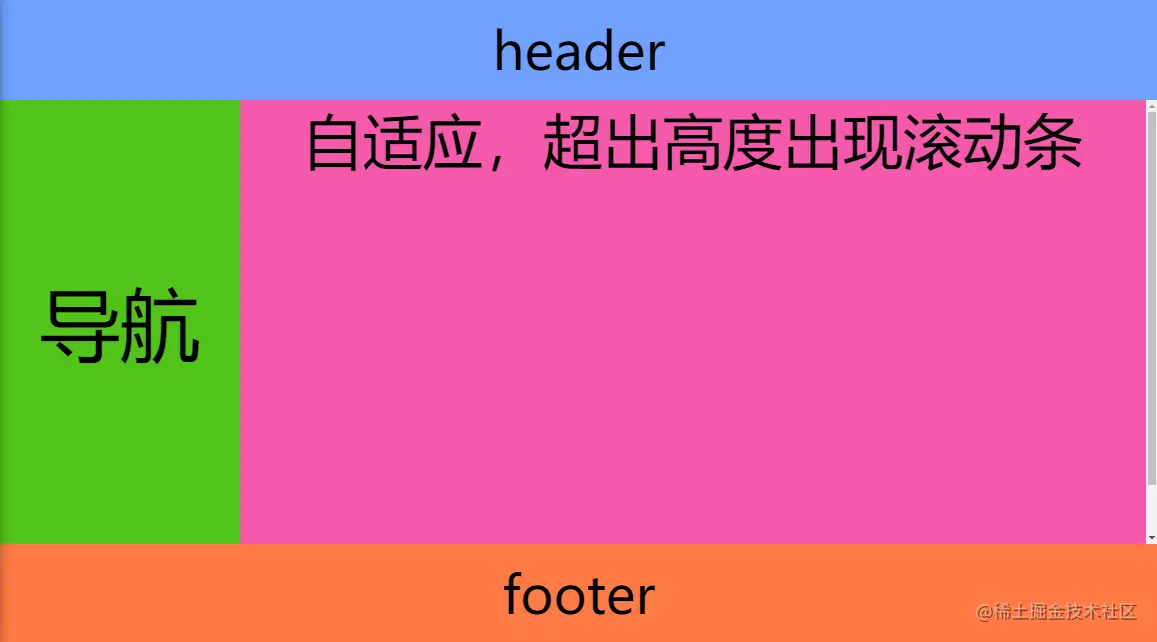
全屏布局
全部布局主要应用在后台,主要效果如下所示:
1. calc 函数
1
2
3
4
5
6
7
8
9
10
11
| .content {
overflow: hidden;
height: calc(100vh - 200px);
}
.left {
height: 100%;
}
.right {
overflow: auto;
height: 100%;
}
|
2. flex
1
2
3
4
5
6
7
8
| .container {
display: flex;
flex-flow: column;
}
.content {
overflow: auto;
flex: 1;
}
|
3. gird
1
2
3
4
5
6
7
| .container {
display: grid;
grid-template-rows: auto 1fr auto;
}
.content {
overflow: auto;
}
|